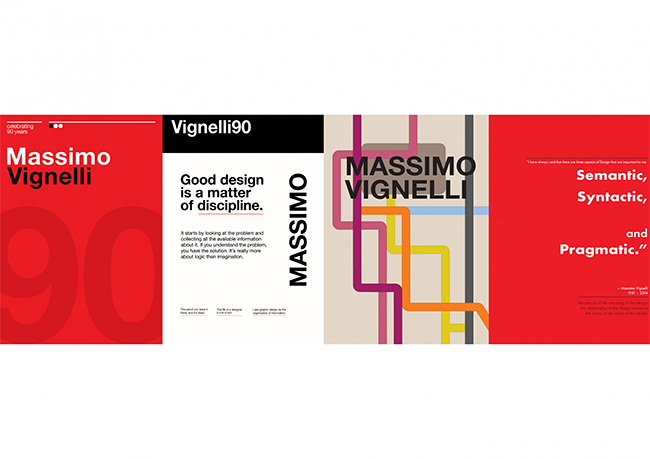
Before stepping into William Truran’s spring 2022 Graphic Design IV course, students Joey Winton, Jameson Officer-Thurston '22, Kailyn Groski and Eric Castaneda hadn’t heard much about Massimo Vignelli. But they had certainly seen his designs.
Vignelli created the graphics and diagrams for New York City’s subway system. He designed logotypes for American Airlines and Bloomingdale’s, and implemented a design system used in unifying U.S. National Parks publications. His, and his wife Lella’s, work brought modernism to the U.S. and has inspired countless designers through the 20th and into the 21st century.
You can learn more from the Rochester Institute of Technology’s Vignelli Center for Design Studies. Or you can talk to Truran — he completed his masters degree at RIT, and brought an enthusiasm for Vignelli with him from the east coast to his classroom as an assistant professor at Doane.

Which is how he learned that a global, digital exhibit celebrating Vignelli’s 90th birthday and legacy (he died in 2014; Lella died in 2016) was in the works by Uruguayan designer Amijai Benderski, along with designers Santiago Ternande and Juan Martín Lusiardo.
“We found out probably a year and a half, two years ago that he [Benderski] was going to do this,” Truran said, while he was still at RIT. “It was really cool because there was no gatekeeping. Anyone can join, anyone who thought Vignelli was important, or anyone whose professors thought Vignelli was important, would be able to participate.”
The Vignelli 90 exhibit was open to artists around the world to submit an A2-size design showcasing their vision of Vignelli’s legacy — 252 posters were received from artists in 46 different countries, ranging from undergraduate students to professionals with decades-long careers.

The students in Graphic Design IV started by researching Vignelli. Posters were due in mid-February and the full exhibit launched just before the end of the semester in May.
“It was exciting to try and figure out a way to design a single piece of art that ‘summarizes’ the entire design career of another person,” Winton said. “As an artist/designer, having more empty space than content is a concept that I am slightly uncomfortable and unfamiliar with. Finding a way to create a poster that reflects Vignelli's style and values while also making it my own was a good challenge.”

Winton said it was also challenging to use fewer design elements — he chose to use a minimal color palette highlighting a quote from Vignelli, with subtle geometric accents. Groski chose to echo the subway diagram. Officer-Thurston was influenced by the National Parks posters, and included several of Vignelli’s quotes. Castaneda went with a bold red and a nod to the subway graphics.

“There was an excitement, I think, in all of them,” Truran said, to dive into the project, even though it was different and coming toward the end of their college careers. “They all did quite a bit of research beforehand, which I think helped, and can be seen through their projects.”

